The 2027 paint colours featured here lean toward greens, softened pinks and earthy warmth. For Calgary and Airdrie homeowners, the useful question is where those colours fit: a restful bedroom, a welcoming living room, a dining room with character or a smaller architectural accent.
This guide compares five confirmed 2027 Colour of the Year selections and two additional ideas. Fine Paints of Europe’s Drama Queen Black is its 2026 selection. Farrow & Ball’s Naperon is Dynamic Painting’s complementary colour pick, not presented as an official 2027 winner. Manufacturer announcements were checked on October 15, 2026; room recommendations below are our design suggestions.
The seven images are AI-generated colour illustrations created for Dynamic Painting. They show inspiration, not completed client projects or exact paint samples.
2027 paint colours at a glance
Use this comparison to shortlist a direction. The suggested rooms are starting points; existing finishes and the light in your own home decide the final choice.
| Brand and colour | Status | Where to begin |
|---|---|---|
| Benjamin Moore — Webster Green HC-130 | 2027 selection | Living room, study, painted trim |
| Sherwin-Williams — Celery SW 6421 | 2027 selection | Bedroom, breakfast nook, bathroom walls |
| Dulux Canada — Birthday Cake DLX1059-2 | 2027 selection | Living room, bedroom, entry |
| Cloverdale — Calliope 0044 | 2027 selection | Reading nook, bedroom, dining area |
| C2 Paint — Pueblo C2-510 | 2027 selection | Dining room, lounge, accent wall |
| Farrow & Ball — Naperon No.315 | Dynamic colour pick | Dining nook, snug, warm living room |
| Fine Paints of Europe — Drama Queen Black | 2026 selection | Interior doors, study, feature details |
What do the brands’ colour choices have in common?
Our reading of these palettes is that colour is becoming easier to live with without disappearing into the background. Webster Green and Celery share a green direction, but serve different purposes: Webster Green provides more visual weight; Celery offers a lighter, yellow-green alternative. They belong to the same broad family, not the same colour.
Birthday Cake, Calliope and Pueblo share a softened rose direction. Birthday Cake starts the conversation gently; Calliope adds a dustier presence; Pueblo introduces a more earthen, mauve character. Naperon extends that warmth toward terracotta. Treat them as alternatives to compare, rather than a recipe requiring four pink or clay colours in adjoining rooms.
The manufacturers also connect colour with natural materials and personal surroundings. Our practical interpretation is to keep the flooring, stone, fabrics and furniture you enjoy, then choose paint around them. Cream upholstery, timber and a repeated metal finish can connect different rooms without making every wall identical. Drama Queen Black adds a separate option for strong contrast.
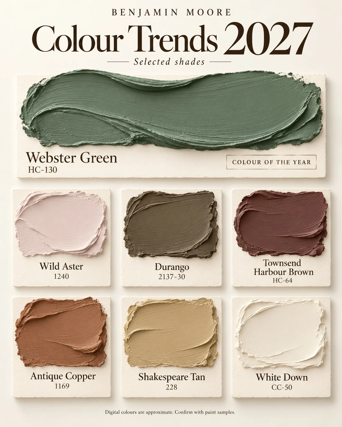
Benjamin Moore: Webster Green HC-130
Benjamin Moore describes its 2027 choice as a versatile mid-tone green with a connection to traditional interiors and relevance today. Its official Colour Trends 2027 collection combines green with pastels, browns and ochre tones.
Consider Webster Green for living-room walls, a study or painted interior trim beside a quieter wall colour. A green doorway can repeat a colour already present in artwork without committing the entire open-plan main floor.
The supporting palette provides different levels of intensity: Wild Aster 1240 and White Down offer softer possibilities; Durango 2137-30 and Townsend Harbour Brown HC-64 give deeper accents. Antique Copper 1169 and Shakespeare Tan 228 introduce warmth. Our Benjamin Moore palette guide covers each shade, the omitted Nelson Blue CW-635, and White Down’s CC-50/OC-131 listings.

Sherwin-Williams: Celery SW 6421
Sherwin-Williams presents Celery as a light herbal green through its Refresh & Restore theme. The official 2027 colour page includes a coordinating palette and physical sample options.
Try it in a bedroom where you want visible colour with a lighter backdrop, or in a breakfast nook with natural wood and uncomplicated fabrics. On bathroom walls, compare the sample against the vanity, tile and countertop before deciding: those fixed finishes may contain competing undertones.
Compared with Webster Green, Celery is a different level of commitment. It can cover more wall area while keeping a softer impression. Its yellow-green character still needs testing beside creamy trim and honey-toned flooring; a pleasing combination in one room can look too yellow in another.

Dulux Canada: Birthday Cake DLX1059-2
Dulux Canada’s 2027 announcement and trends palette centres on Birthday Cake, a gentle pink associated with optimism and enjoyment of everyday spaces. Its wider palette includes muted greens, warmer accents and supporting neutrals.
Our suggested starting points are a bedroom, sitting room or entry where a plain white feels less inviting than you want. Cream upholstery, a woven rug and restrained brass details can make the colour feel composed rather than themed. Keep large surrounding elements simple while deciding how much pink you want.
Birthday Cake and Benjamin Moore’s Wild Aster occupy a similar soft-pink conversation, but they are not interchangeable formulas. Sample both beside your actual white trim. If the room already has pink-beige tile or carpet, check whether the new wall colour harmonizes with it or makes its undertone more noticeable.
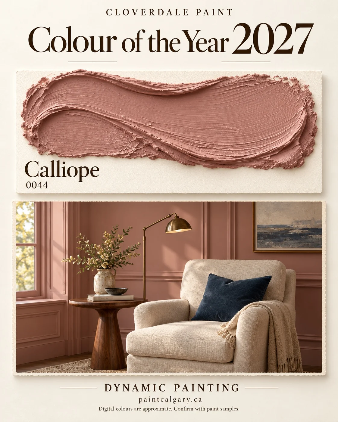
Cloverdale Paint: Calliope 0044
Cloverdale describes Calliope as a deeper dusty pink inspired by the calliope hummingbird, with a mineral quality. Its 2027 Colour of the Year page discusses rooms shaped by meaningful objects and offers several palette directions.
Consider it for a reading nook, bedroom or dining area with furniture you want to keep. Our illustration pairs rose walls with cream upholstery and a navy cushion: the darker accent gives the scheme definition without adding another painted surface.
Compared with Birthday Cake, Calliope is worth sampling when you want pink to be more noticeable. With warm wood, start by checking the timber’s red or orange cast. Keep one large neutral element, such as curtains or a rug, to give the eye somewhere quieter to rest.

C2 Paint: Pueblo C2-510
C2’s Rural Renaissance palette places Pueblo between pink and terracotta, with an earthy mauve character. In its explanation of the selection, C2 emphasizes how the colour appears rosier in daylight and deeper as daylight fades.
That makes an evening-used dining room or lounge an interesting place to test it. Look at a sample while the dining pendant or reading lamps are on, not only beside a sunny window. Stone, linen and wood offer useful materials to compare alongside it.
For a smaller change, try the wall behind a dining table or headboard. Choose a wall with a clear architectural boundary. Pueblo connects with Calliope’s rose direction, while its depth provides an alternative for homeowners considering a richer, more enveloping room.
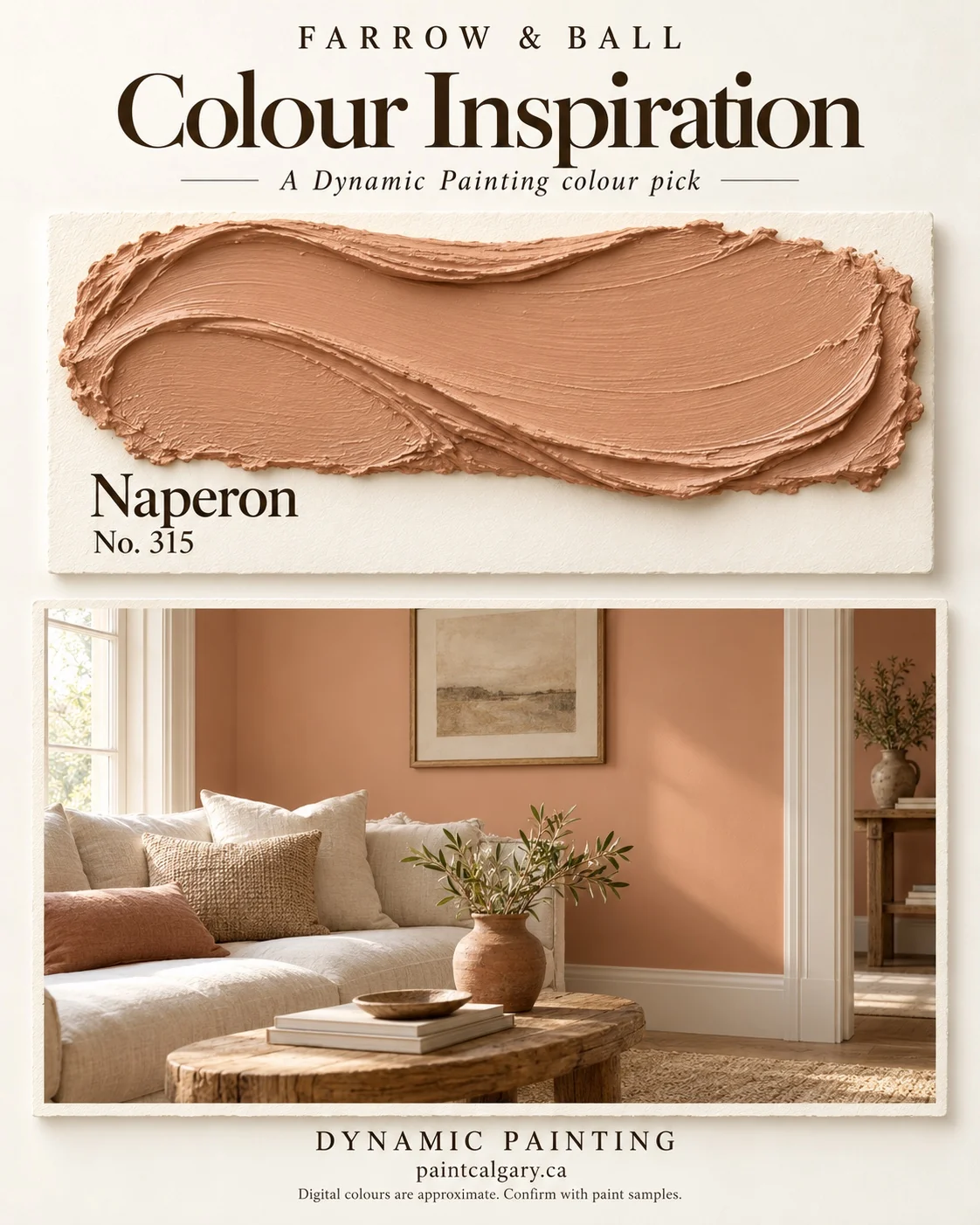
Farrow & Ball: Naperon No.315
Farrow & Ball’s Naperon colour page describes a familiar clay-like terracotta and identifies Stirabout as its complementary white. We included Naperon because it extends the earthy warmth seen elsewhere in this guide.
Try it in a dining nook, snug or living room with cream textiles and natural wood. Against those materials, the orange-clay direction can feel deliberately warm. A smaller wall area may be enough if your flooring is already strongly orange or red.
Naperon is a useful comparison with Pueblo when choosing between terracotta and a rosier earth tone. Put the samples on separate boards and examine them in the same location. The artwork is our inspiration concept; it does not establish how either paint will look under your lamps.

Fine Paints of Europe: Drama Queen Black
Fine Paints of Europe’s 2026 announcement highlights black on architectural details and describes its featured glossy room in Hollandlac Brilliant 98. We are carrying that idea into this planning guide, not relabelling it a 2027 selection.
Interior doors, selected trim or a study are useful places to explore black. Start with one defined element if a completely dark room feels like too much. Pale upholstery, warm timber and layered lighting can keep the room’s objects visible against the backdrop.
Separate colour from finish. The reflective effect in the illustration is a different specification from a matte black wall. Discuss surface preparation, sheen and the appropriate coating before approving the job; consult the manufacturer’s Brilliant 98 product guidance for that finish.
How to carry the colours through your home
Living rooms and open-plan spaces: choose the largest wall area first. Then test an accent while standing where you can also see the kitchen and hallway. Repeat a colour in artwork or textiles before adding another painted wall.
Bedrooms: compare Celery or Birthday Cake for a lighter backdrop, and Webster Green or Pueblo for greater depth. View the sample from the bed with your usual evening lighting and bedding in place.
Kitchens, bathrooms and busy halls: assess the fixed materials before the trend. Green next to warm wood, or pink beside stone, may work beautifully, but colour alone does not determine suitability. Confirm a coating appropriate for the surface, cleaning and moisture exposure.
Dining rooms and studies: Calliope, Pueblo, Naperon or black can establish a stronger mood. Try the colour on a contained wall or interior door first. For an immersive approach, our colour-drenching guide explains planning walls, trim and ceilings together.
A practical sampling checklist before you commit
- Gather what stays. Bring flooring, countertop, fabric and trim references into the same decision. Start with two or three candidates rather than a wall of competing swatches.
- Use physical samples. Compare larger samples in the actual room. Digital artwork is for direction; it cannot show the exact result of your chosen paint, sheen and lighting.
- Check several positions and times. Move samples between the window wall, shaded wall and adjoining doorway. Review them in daylight and with your normal lamps. This matters in Calgary and Airdrie rooms with changing daylight or limited basement windows.
- Approve the whole specification. Record the brand, colour code, paint product, sheen and surfaces. If considering a match in another brand, compare a dried sample before committing; a similar name or screen swatch is not proof of equivalence.
Our lighting and paint-colour guide develops this process. Benjamin Moore also provides guidance for north-facing rooms and recommends checking samples in your actual space.
Common questions about the 2027 colours
Which 2027 paint colour is best for my whole home?
No single selection fits every home. Start with fixed finishes, adjoining sightlines and the atmosphere you want. A trend colour may be most useful in one room, with quieter connecting spaces.
Can I mix colours from different paint brands?
Yes, as a design choice. Compare physical samples together and specify each coating separately. Colour coordination does not make the products equivalent in preparation, sheen or application requirements.
Do I need to repaint all the trim?
No. Test your preferred wall colour beside existing trim first. Keep trim that works with the scheme, or include it deliberately when planning a more continuous colour treatment.
Choose your colours with Dynamic Painting
Love one of these palettes, or prefer a completely different style? Through Dynamic Colour Confidence, clients who book a painting project can access a professional interior designer for help choosing colours around their lighting, furniture, finishes and personal taste. Dynamic Painting then plans the preparation, coating and sheen for the agreed work.
Explore our interior painting and designer-supported colour selection or book your free on-site painting estimate for your Calgary or Airdrie home.
Source note: manufacturer links above support the colour names, codes, announcement years and brand descriptions. The comparisons and suggested room applications are Dynamic Painting’s interpretation. Always confirm colour with physical samples.