A practical sample test for Calgary homeowners planning an interior repaint.
The grey looked calm in the store. At home, it looks blue beside the sofa. By evening, you're wondering whether you brought home the wrong can.
Before you change colours, check the conditions in the room. Daylight, lamps and the surfaces beside the paint all affect what you see. A colour name cannot tell you how the finished room will feel.
Quick answer: Test your shortlisted colours in the room you intend to paint, in daylight and under the lights you actually use. Keep a short record of what changes. Confirm the final product and sheen as well as the colour before the work begins.
Why the same colour looks different at home
Window direction is a useful starting point. Northern light tends to be cooler and more muted. A colour that feels balanced somewhere else may read differently there. Benjamin Moore's north-facing room guidance also notes that seasonal light changes matter.
That does not mean every north-facing room needs the same warm white. The useful question is whether a particular sample works in your room.
Time matters too. An east-facing room generally gets more direct morning light, followed by more subdued light later in the day. If you mostly use that room after work, a morning-only test misses the conditions that matter most to you. See Benjamin Moore's eastern-exposure guidance.
Treat direction as a clue, then test the actual space. Trees, nearby buildings, window coverings and adjoining rooms can make a simple compass label an incomplete description.
Give the sample a fair test
Start with a manageable shortlist. Two or three candidates are easier to compare carefully than a wall covered in every white in the store.
Use a sample format intended for colour selection. A movable painted board lets you check different walls and bring the colour beside trim or flooring. Follow the sample product's application and drying instructions before judging it.
Benjamin Moore recommends movable foam-board samples in its colour-testing advice. Its brush-on samples are designed for colour representation; they do not contain all the performance ingredients of its regular paints. A sample therefore does not establish the finished coating's washability or durability. Read the sample product information.
Do not leave your favourite candidate in the best-lit spot while its rival sits in a dark corner. Move each through the same positions and write down the conditions. You're choosing paint, not running an election with a preferred candidate.
Use the room's normal routine
Make your checks fit the way you live:
| Check | What to record |
|---|---|
| Morning | The time, available daylight and whether room lights are on. |
| Afternoon | Whether the room is sunny or overcast, and which wall you are viewing. |
| Evening | The lamps and ceiling lights you normally use. |
| Beside existing finishes | How the sample looks beside the trim, floor, cabinets or other surfaces staying in place. |
| From an adjoining room | Whether you still like the choice from the doorway or through an open-plan space. |
If you intend to change the room's lighting, include the planned lighting in your checks where possible. Otherwise, you may be approving a colour under conditions you are about to replace.
For wider decisions about coordinating a palette, use our Calgary paint colour guide. This test is for judging your shortlist in the actual room.
A real home: where we would compare samples
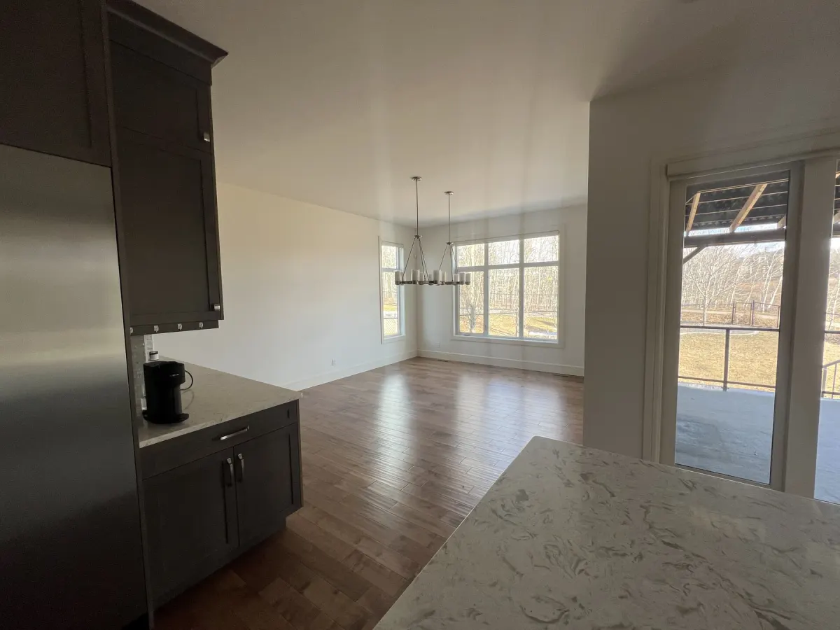
The dining-area photograph above and the kitchen view below show the same completed Dynamic Painting interior. The open sightline connects light walls, dark cabinetry, wood flooring and a light countertop. These are useful comparison points because a wall-colour decision has to work beside the finishes that will stay.
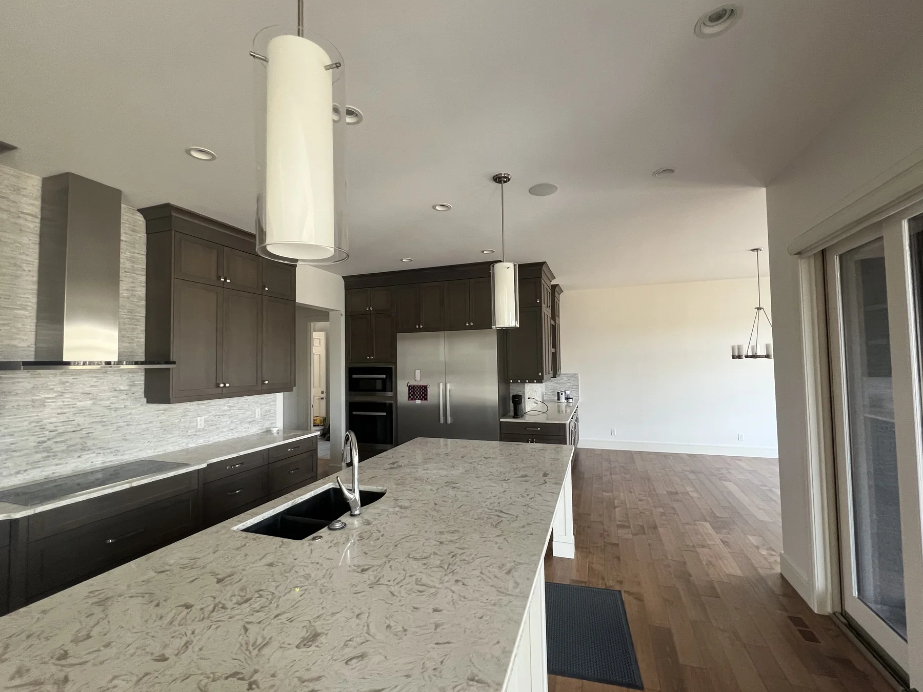
Two views of one completed home. They illustrate where to place samples; they are not a documented before-and-after or daylight-versus-evening sample test.
| What is visible in this home | Where we would check each candidate | What we would record |
|---|---|---|
| Dark kitchen cabinets beside lighter surfaces | Beside the cabinet edge and countertop | Whether the candidate still feels right with both finishes in view. |
| A broad dining wall and wood flooring | On the dining wall, then close enough to compare with the floor | Whether the relationship changes between daylight and the household's usual evening lighting. |
| An open view between kitchen and dining area | In each proposed wall position, viewed from the adjoining space | Whether one candidate works across the connected rooms. |
This is a proposed test plan based on the photographs, not a record of tests performed on this project. The pictures do not establish the paint code, window direction or lighting settings. The useful lesson is to choose comparison positions before choosing a winner.
Your colour-sample observation sheet
Download the free two-page Colour Testing Kit (fillable PDF).
Type into the PDF or print it. Page one records the actual sample labels, finishes and comparison positions. Page two logs observations and the final colour, product, sheen and approval. Use another copy for each room or additional checks. No email address is required.
Use Keep, Recheck or Rule out for each observation. These describe your preference, not a technical score. A candidate stays unresolved until you have checked the conditions that matter to you. Leave a field blank if you do not know the answer.
For a quick handwritten version, use the tables below:
| Room record | Your notes |
|---|---|
| Room and wall positions checked | ____________________ |
| Main window direction, if known | ____________________ |
| Existing finishes staying in place | ____________________ |
| Usual lamps and ceiling lights | ____________________ |
| Sample A: colour name/code and sample product | ____________________ |
| Sample B: colour name/code and sample product | ____________________ |
| Sample C, if needed | ____________________ |
| Check and date | Light / position | Sample and observation |
|---|---|---|
| Morning: __________ | __________ | __________ |
| Afternoon: __________ | __________ | __________ |
| Evening: __________ | __________ | __________ |
| Beside trim or flooring: __________ | __________ | __________ |
| From the adjoining room: __________ | __________ | __________ |
Write something specific. “Too creamy beside the trim with the lamps on” gives you a useful reason to reconsider a sample. “Maybe” gives you another trip to the paint store.
If you change a bulb, move the board or come back on a different day, note it. You do not need perfect weather or a scientific experiment. You need enough observations to explain which choice you prefer and where you still have doubts.
Example worksheet entry: “Sample B works beside the floor in daylight. Recheck it under the dining lights before deciding.”
Keep photographs as a record of where you placed samples, but make the colour decision in person. Benjamin Moore cautions that screen and printed colours can differ from actual paint.
Turn a concern into the next check
| Your observation | Useful next step |
|---|---|
| “I like it in daylight, but not after dinner.” | Recheck under the evening lights you intend to keep before approving it. |
| “It works by the floor but clashes with the trim.” | Compare every shortlisted sample beside that same trim; record which relationship bothers you. |
| “It looks good in the photo but wrong in the room.” | Judge it in person. Use the photograph to record placement, not to settle the colour. |
| “We changed the bulbs halfway through.” | Record the change and compare the remaining candidates under the new setup. |
Sharing the kit: Homeowners, designers and realtors can use the blank worksheet when planning an interior repaint. If you are writing a colour-selection resource, link to this lighting guide so readers can find the kit and its instructions together.
Confirm more than the colour name
Once you have a favourite, make the agreement clear:
- The colour name and code.
- The final paint manufacturer, product line and sheen.
- The walls or other surfaces receiving that finish.
- Any further sample or finish check agreed with your painter.
- Who approves the choice, and when that approval happens.
A colour sample and the final coating have different jobs. If sheen is still undecided, read our paint-finish comparison and discuss the actual room requirements before approving the finish.
Keep this record with your project notes. It gives everyone a clear reference before the remaining surfaces are painted.
Questions worth settling before you commit
Does a colour looking different mean the paint was mixed incorrectly?
Not necessarily. First compare it under the room's different lighting conditions and check the labels. If the colour code or product details do not match what you ordered, ask the retailer or painter to investigate.
Do I need to test every room?
Check each room where the choice matters, especially when the lighting and surrounding finishes differ. One sample viewed in the kitchen does not show you what you will think of it in the hallway.
What if I still cannot choose?
Write down the concern rather than adding more candidates immediately. Is the colour too dark at night? Does it feel wrong beside the trim? A specific question makes a colour discussion more useful.
Bring your shortlist. We'll help you plan the repaint.
If you're planning an interior repaint in Calgary, bring your samples and room notes to the estimate. Marc reviews the rooms and existing finishes before quoting. Once your painting project is booked, professional designer colour-selection support is available through Dynamic Colour Confidence.
You do not need every colour settled before asking about the work. Tell us which rooms you want painted and what is making the decision difficult.